Variants and interactive states
A component set groups the variants of one component, and the layer name of each variant says which variant and which state it is. You need it when instances have to react to the pointer or remember a checked state in preview: a component behavior switches between the state variants you have drawn. Also called: interactive components, hover and pressed states.
A component behavior (Button, Checkbox, Color input, Input, Radio button, Slider, Textarea, Toggle) belongs to a component set. For the object behaviors Draggable, Resizable and Sortable see object behaviors; for Scrollable and Pannable see Scrolling in preview.
Component sets and variants
Where: select two or more standalone components → Properties panel → Combine as variants. Select one component or one component set → Properties panel header → the Add variant button.
- Add variant on a standalone component wraps it in a new set first. With the set selected, it duplicates the top-left variant. With a variant selected, it duplicates that variant.
- A set holds only components and guides. A plain frame dropped into a set in the Layers panel, or pasted into it, becomes a variant, unless it contains a component. No other layer goes in, and sets don't nest.
- Wrapping variants in a frame, boolean or Flex or Grid frame is refused with a message, since the wrapper would land inside the set. A set and each variant can still have Flex or Grid layout of their own; on the set it arranges the variants.
- There are no variant properties. The layer name alone tells variants and states apart.
- Duplicating or pasting inside a set also yields variants (→ How instances come about).
Naming states
A variant's layer name reads Variant:state. The text before the first colon is the variant name, every colon-separated part after it is a state: Primary, Primary:hover, Secondary, Secondary:hover are two variants with two states each. A name without a suffix is the Default state.
The name is what ties a variant to a state, and it follows CSS pseudo-classes. In CSS, button:hover selects a button while the pointer is over it. In Moio, Primary:hover is the variant that the set's behavior shows on an instance of Primary while the pointer is over it. :hover, :active, :focus and :checked mean what they mean in CSS, and they chain the same way: :checked:hover. :unchecked, :on, :off and :placeholder are Moio's own names, for states that CSS writes differently.
One thing differs from CSS. A :hover rule in CSS changes a few properties on top of the normal style. A state variant is a complete drawing of its own: a layer, an event or a slot frame that Primary:hover lacks is absent while it shows (→ Events on state variants, slots in variants).
- Spell the variant-name part identically across its states, letter case included:
Primaryandprimary:hoverare two variants, to the behavior and in the Variant dropdown alike. - States combine, and their order is irrelevant:
:checked:hoverand:hover:checkedare the same state. Spaces around the colons are ignored; letter case is not, so a behavior never showsPrimary:Hover. - Of two variants with the same variant name and state, a behavior uses the one higher in the Layers panel.
- A behavior never switches to a suffix it doesn't understand. With No behavior any suffix is a state, picked by hand (→ Variant and State on an instance).
- Renaming several variants at once keeps every suffix the set's behavior understands:
Primary:hoverrenamed toMainbecomesMain:hover. With No behavior the whole name is replaced.
Component behavior
Where: select a component set, one of its variants, or a standalone component → Properties panel → the dropdown without a label (tooltip Behavior).
Picking a behavior for a standalone component turns it into the only variant of a new component set, and the set gets that behavior.
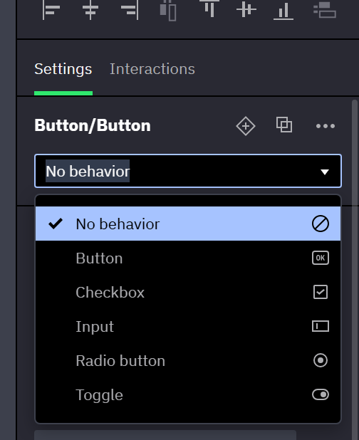
| Option | In preview |
|---|---|
| No behavior | Nothing switches on its own. |
| Button | Follows the pointer: hovered, pressed. |
| Checkbox | Follows the pointer; a click flips the checked state. |
| Color input | Follows the pointer; a click opens the browser's color picker (→ Color input). |
| Input | A text field to type into (→ Text fields and forms). |
| Radio button | Follows the pointer; a click checks it, never unchecks it (→ Radio groups). |
| Slider | A thumb dragged along a track picks a number (→ Slider). |
| Textarea | A text field of several lines (→ Textarea). |
| Toggle | As Checkbox, with the states :on and :off. |
- A behavior runs in preview only. The canvas shows the variant you picked, or the one that matches Checked.
- Slider is the one behavior that needs particular layers in every variant (→ Building a slider).
- State switches in preview are instant unless the set has a transition. The transition rows sit below the dropdown (→ Transitions between states).
The Add state button in the Properties panel header, shown while the set has a behavior, lists the common states of the behavior. With the component set selected, picking one creates it for every variant name that lacks it, as a copy of an existing state of that variant: the state it builds on when there is one (:checked:hover copies :checked), otherwise the base state. With a variant selected, it creates the state for that variant name only, as a copy of the selected variant — so a styled :hover becomes the starting point for :active. The new state variants are selected. The menu leaves out :active for Checkbox, Radio button and Toggle, and every :active:hover and :focus:hover; create those by naming a variant yourself.
States per behavior
| Behavior | Base states | Added to each base state |
|---|---|---|
| Button | Default | :hover, :active, :active:hover |
| Checkbox | :unchecked, :checked | :hover, :active, :active:hover |
| Color input | Default | :hover, :active, :active:hover |
| Radio button | :unchecked, :checked | :hover, :active, :active:hover |
| Slider | Default | :hover, :active, :active:hover, from the thumb only (→ Slider) |
| Toggle | :off, :on | :hover, :active, :active:hover |
| Input | Default, :placeholder | :hover, :focus, :focus:hover (→ Text fields and forms) |
| Textarea | Default, :placeholder | :hover, :focus, :focus:hover, as Input |
:activemeans pressed. The parts combine as:checked:active:hover.- Checkbox, Radio button and Toggle have no Default state: name the two base variants
:uncheckedand:checked, or:offand:on. - Only the base states are required. Within the current base state, preview shows the first variant that exists —
:active:hover→:active→:hover→ base state while pressed and hovered,:hover→ base state while hovered. - When the base state is missing too, the instance stays on the variant it shows in the editor.
Color input
A component set with the Color input behavior is a color chooser, like a color field in a browser form. In preview, a click anywhere on an instance opens the browser's own color picker, and the color the viewer picks becomes the instance's value of the set's built-in Color input.
- Choosing Color input adds one Color input marked Built-in to the set, named Color, black by default. An existing Color input named "Color" is taken over instead. It can be bound like any other Color input (→ Component inputs).
- Bind the fill or stroke of the layer that shows the color to Color, in every state variant: right-click Fill → Bind input → Color. Without such a binding the picker opens and the value changes, but nothing on the instance shows it.
- The picker edits the color only. An instance whose Color is translucent stays translucent: the picked color takes the alpha the value had.
- The pick is kept in preview only and is never written to the document. A Set Component Input action or a variable bound to Color replaces it, a Reset action on the instance restores the assigned or default color, and so does a reload. With Color bound to a value variable, a pick writes the variable (→ Two-way binding on controls).
- States are those of Button: Default,
:hover,:activeand:active:hover, with the Hover & press transition row. The instance stays in:activefor as long as the picker is open. There is no focus state, and the instance opens the picker on click only, not from the keyboard.
Slider
A component set with the Slider behavior is a horizontal slider, like a range field in a browser form. In preview the viewer drags its thumb along its track, or clicks the track to jump there, and the number the thumb lands on becomes the instance's value of the set's built-in Value input.
Building a slider
Every variant of the set needs two layers with fixed names, written in capitals:
| Layer | What it is |
|---|---|
TRACK | A frame, anywhere in the variant, or the variant itself. It doesn't need to be visible. |
THUMB | Any layer directly inside TRACK: a shape, a frame, an instance of a knob component. When TRACK is a Flex or Grid frame, turn on Use absolute positioning for THUMB. |
TRACK is a rectangle the slider measures, not a graphic, and it can stay without fill or stroke. It does two things only:
- It contains the thumb: the thumb travels between its left and right edges.
- It is the click target: a click anywhere inside it jumps the thumb there.
Draw the bar the viewer sees as a layer of its own, inside TRACK behind the thumb or anywhere else in the variant. A click on a bar outside TRACK does nothing, so for a thin bar that is easy to hit, make TRACK as tall as the thumb and put the bar inside it.
- A layer named
Thumbortrackdoesn't count, and neither do layers inside a nested instance. - Add state copies the variant with its layers, so build the parts once in the default variant.
- The Validation console lists every variant whose parts are missing, doubled or misplaced, with the layer to rename when only the letter case is off (→ Validation console). While any variant of the set is listed, its instances don't respond in preview.
Value, Start, End and Step size
- Choosing Slider adds four built-in Number inputs: Value (50), Start (0), End (100) and Step size (1). Existing Number inputs named "Value", "Start", "End" or "Step size" are taken over instead.
- Start is the left end of the track and End the right one. Start may be larger than End for a slider that counts down.
- The thumb moves in steps of Step size counted from Start toward End: with Start 0 and a Step size of 5, it stops at 0, 5, 10 and so on. The sign of Step size doesn't matter, so 5 and -5 step alike, on a slider that counts up and on one that counts down. A Step size of 0 steps by 1.
- When End is not a whole number of steps away, the last step is the remainder, so the thumb always reaches End: from 0 to 10 in steps of 4, it stops at 0, 4, 8 and 10.
- A value outside the range or between steps shows as the nearest step within the range, as in a browser range field: on a 0–100 slider stepping by 1 a Value of 150 shows as 100, and 37.5 as 38. The input, and a variable bound to it, keep the number they were given.
- All four can be bound, under Bind input: a text whose content shows Value is a live readout, and texts showing Start and End label the ends.
- With Value bound to a value variable, dragging the thumb writes the variable (→ Two-way binding on controls). Otherwise the dragged value is kept in preview only: a Set Component Input action or a bound variable replaces it, and a Reset action on the instance or a reload restores the assigned value.
The thumb in preview
- The thumb sits where Value puts it: its left edge on the track's left edge at Start, its right edge on the track's right edge at End. Its vertical position is the one you gave it in the variant.
- A press on the thumb drags it from where you grabbed it. A click on the track jumps the thumb's center there, and keeps dragging while the button is held.
- On the canvas the thumb stays where you placed it in each variant, whatever an instance's Value; it moves in preview only.
- States are those of Button: Default,
:hover,:activeand:active:hover, with the Hover & press transition row. Only the thumb hovers and presses the slider: hovering the track does nothing, and a press on the track shows:activeonce it has jumped the thumb. While the thumb is held, the slider stays hovered and pressed even when the pointer leaves it. - There is no focus state, and the slider doesn't respond to the keyboard.
Checked and the starting state
Where: component set → Inputs → Checked; instance → the Checked row.
- Checkbox, Radio button and Toggle add the built-in Boolean input Checked to the set (→ Defining inputs). It sets the state an instance starts in when preview loads, and which base variant the editor shows for it.
- On a radio button whose Selected value is bound to a variable, Checked follows the variable and its row is read-only (→ A radio group bound to a variable).
- The value on the set is the default for all instances; the row on an instance overrides it (→ Assigning inputs on instances).
- Clicks in preview change the state for the session only. A Reset action on the instance returns it to Checked (→ Reset).
- Actions on a viewer's click go on the Check and Toggle events.
Radio groups
Radio button instances with the same layer name inside the same artboard form a group, at any depth. Checking one unchecks the others.
- Radio buttons with different names are independent, also on the same artboard. One outside any artboard belongs to no group.
- The editor applies the same rule: turning Checked on for one instance turns it off for the rest of its group.
- In preview, a Set Component Input action or a bound variable that turns Checked on for one instance unchecks the rest of its group too.
A radio group bound to a variable
Where: select a radio button instance → Properties panel → the Option value and Selected value rows.
A Radio button set also has the built-in String inputs Option value, the value an instance stands for, and Selected value, where a variable binds. Give each instance of the group its own Option value (small, medium, large), then bind every instance's Selected value to the same String or Number variable (→ Binding an instance's input to a variable).
- A radio button is checked exactly when the variable equals its Option value, in the editor and in preview. A value that no radio button holds leaves them all unchecked.
- In preview a click on a radio button writes its Option value into the variable, and everything that reads the variable follows (→ Two-way binding on controls).
- Selected value only takes a variable: its row has no value of its own, and Set Component Input never lists it. While it is bound, Checked is read-only and Set Component Input does not list it either; set the variable instead.
- Bind an Option value to a text layer of the set to show it as the radio button's label.
- The Validation console flags a bound radio button with an empty Option value, two radio buttons of one variable with the same Option value, and a group whose radio buttons are bound to different variables or only partly bound (→ Validation console).
Variant and State on an instance
Where: select an instance of a component set → Properties panel → Variant and State.
- Variant lists the variant names of the set. With a behavior, the instance lands on the base state of the chosen variant that matches its Checked value.
- State lists the states of the current variant, Default first. It is hidden when the set has a behavior, and when the variant has only the Default state.
- With No behavior, a state changes only through State in the editor or a Set Component Variant action in preview.
- Switching to another component or set: Instance swap.
Events on state variants
Each variant carries its own events, and an instance runs the events of the variant it shows: a Click defined only on the default variant is absent while :hover shows. What to do about it: Events belong to a variant.
Related
- Transitions between states — animating the switch from one state to another.
- Text fields and forms — the Input behavior and the form kit.
- Overrides — what an instance keeps when its variant or state changes.