Draggable, Resizable, Sortable, Cursor and Pointer events behaviors
Object behaviors make a layer respond to the pointer in preview: Draggable moves it, Resizable resizes it, Sortable lets viewers reorder the items of a Flex frame, Cursor sets the cursor shown over it, and Pointer events lets the pointer pass through it. You need them for drag and drop, reorderable lists, resizable panels, a hand cursor over what viewers click and overlays that must not catch clicks, which events and actions cannot express. Also called: drag and drop, reorderable list, hover cursor, click-through.
For Button, Checkbox, Input, Radio button and Toggle, see component behaviors. For Scrollable and Pannable, see Scrolling in preview.
Adding a behavior
Where: Settings tab → Behaviors → the + button (tooltip Add behavior).
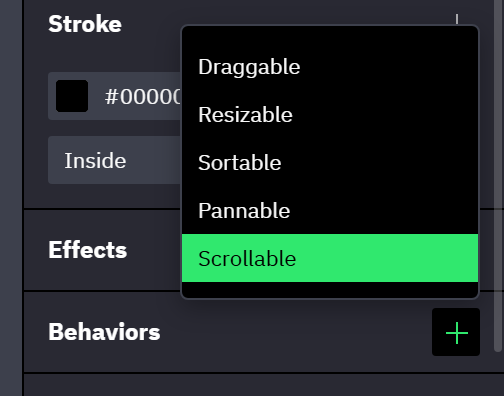
- A layer carries one behavior of each type.
- Draggable, Resizable, Cursor and Pointer events are offered on every layer. Sortable, Pannable and Scrollable are offered on frames, including artboards, components and instances, and are disabled for every other layer.
- Behaviors run in preview only. A Sortable frame runs its Drop events when an item is dropped into it; the other behaviors fire no events of their own. A Size Enters Range or Size Exits Range event on the layer does react while a viewer resizes it (→ Events and actions reference).
- The Validation console lists a behavior that cannot work: a Draggable without its handle object, a Sortable on a frame without Flex layout, or an instance's behavior that its main component also has (on instances).
Draggable
Where: Settings tab → Behaviors → the + button (tooltip Add behavior) → Draggable.
- The layer is not confined to its parent; a parent with Clip content on cuts it off at its edge.
- With Handle set to Child object, Object lists the layer's direct children. Pressing anywhere inside the chosen child drags the whole layer; pressing the rest of the layer does not start a drag.
- A dragged or resized layer keeps its Constraints. A layer pinned to the right edge stays pinned to it, at the distance where the viewer let go.
- Dragging the layer does not click it: a Click event on it runs only for a press that does not move it.
Resizable
Where: Settings tab → Behaviors → the + button (tooltip Add behavior) → Resizable.
- There are no visible handles. The pointer turns into a resize cursor within a few pixels of each edge and corner.
- Keep aspect ratio applies to the corners only. Dragging an edge still changes one axis.
- Minimum and Maximum sizes hold while resizing: the edge stops at the limit.
- The dragged edge follows the pointer and the opposite edge stays put, whatever the layer's Constraints are.
Sortable
Where: Settings tab → Behaviors → the + button (tooltip Add behavior) → Sortable.
Sortable goes on the list, not on its items: every direct child of the frame becomes an item a viewer can drag to a new place. The frame needs Flex layout; on a Grid frame or a frame without managed layout nothing happens in preview. Wrapping lists work.
| Mode | While the viewer drags |
|---|---|
| Immediate (the default) | The other items slide aside and leave a gap where the item will land |
| On drop | The items stay put and a line marks where the item will land; the order changes on release |
- An item can be dragged from one Sortable frame into another and stays there after release. While it is over the other frame, that frame's Mode applies.
- Releasing an item outside every Sortable frame puts it back where it started.
- Dragging an item does not click it: a Click event on the item runs only for a press that does not move it.
- After each drop into it, the frame runs its Drop events, with the position the item landed at as
$event.dropIndex(→ Drop). - On a Repeater, a drag writes the new order to the Repeater's array, and items move only between Repeaters of the same component (→ Reordering and moving items).
Cursor
Where: Settings tab → Behaviors → the + button (tooltip Add behavior) → Cursor.
- Cursor offers the standard cursors of the browser and starts at Pointer, the hand. Hovering an option in the list shows that cursor. Custom cursor images are not available.
- The cursor shows over the layer and everything inside it, its text included, unless a layer inside has a Cursor of its own. Links in text keep the hand, and editable text keeps the text cursor.
- Without it, preview shows the arrow. A Click event does not turn the pointer into a hand.
- On a Draggable or Pannable layer, the cursor replaces the open hand while nothing is dragged, and a drag still shows the closed hand. The edges of a Resizable layer keep their resize cursors.
Pointer events
Where: Settings tab → Behaviors → the + button (tooltip Add behavior) → Pointer events.
| Mode | In preview |
|---|---|
| Disabled (the default) | The layer and everything inside it let the pointer through: clicks, hovers, presses, drags and the wheel reach the layers below instead |
| Enabled | A layer inside a disabled one reacts to the pointer again, with everything inside it |
- On a disabled layer and the layers inside it, Click, Double Click, Check, Toggle, Pointer Enter, Pointer Leave, Pointer Down and Pointer Up events do not run, instances show no hover or pressed state, Sortable frames take no dropped items, and Draggable, Resizable, Sortable, Pannable, Scrollable and Cursor behaviors do not react. The Validation console does not report them.
- An Enabled layer inside is the exception. A press on it still reaches the disabled layers around it, as it reaches every parent layer: their Click, Double Click, Pointer Down and Pointer Up events run, a Draggable around it drags, and an instance around it shows its hover and pressed states (→ Order, bubbling and failures).
- The pointer shows the cursor of the layer below a disabled one.
- For an overlay whose empty area lets clicks through while its buttons work, disable the overlay and enable each button. Give the overlay itself no Click event, or a click on any button runs it too.
- Enabled on a layer outside every disabled one changes nothing.
- The behavior covers the pointer only. Text fields inside a disabled layer still take keyboard focus with
Taband typing. - Behaviors belong to a variant, so the disabled state of a button or a card can let the pointer through while its other variants react (→ On instances). A text field's disabled variant still takes typing.
With managed layout
- Draggable has no effect on an item of a Flex or Grid frame, because the layout decides where the item sits. To let viewers reorder the items, add Sortable to the parent frame. A child taken out of the layout with the toggle next to its position fields (tooltip Use absolute positioning) drags like any other layer.
- Resizable does not change the size on an axis where the layer is set to Fill or Hug content. Set that axis to Fixed (→ Sizing).
Combining behaviors
One gesture runs at a time, and the press decides which one.
- On a layer that is both Resizable and Draggable, a press near an edge resizes. Every other press is left to Draggable and its Handle setting.
- A Sortable frame takes the gesture from a Draggable item inside it: a press on an item sorts. A press near the edge of a Resizable item resizes it.
- On a frame that is both Sortable and Draggable, a press on an item sorts and a press on the frame outside its items drags the frame.
- A Sortable frame inside an item of another sorts on its own: a press on one of its items sorts it, a press elsewhere in the outer item sorts the outer frame, and an item dragged over both goes into the inner one. No item can be dropped into a frame inside itself.
- Inside a Pannable frame, a Draggable, Resizable or Sortable layer takes the gesture; pressing anywhere else pans.
- On a touch screen the gesture wins over scrolling: a touch that starts on a Draggable layer (its Handle, if it has one), on an edge of a Resizable layer or anywhere inside a Sortable frame drags and never scrolls a Scrollable frame around it.
On instances
- An instance runs the behaviors of its main component and then its own. The inherited ones are not in the instance's list. A button below it, labeled for example 2 inherited behaviors, selects the layer they are defined on; an instance cannot change or remove them.
- One behavior of each type counts inherited ones too: Add behavior disables a type the main component already has. If the main component gains a type later, the instance's own behavior of that type stops running (the main component's runs), and the Validation console reports it. Detaching the instance keeps only the behavior that ran.
- For a layer inside an instance the Behaviors section is read-only: the layer runs what the component defines.
- Behaviors belong to a variant, like events: an instance runs the behaviors of the variant it shows. A behavior added on the instance itself runs whatever variant shows (→ How interactions run).
What persists
- A dragged position, a resized size and a sorted order are changes of the preview session. They last until the session restarts, by a reload or an entrypoint picked in the preview header, also when the artboard is shown again after a Go To Artboard, like every other session change (→ Variables, Starting over on an entrypoint).
- A Reset action that targets the dragged or resized layer puts it back to its designed position and size (→ Events and actions reference). Target the layer that carries the behavior, not its handle.
- Reset does not touch the order of a Sortable frame. Restarting the session restores the designed order. A Sortable Repeater's order lives in its array, which a restart resets with the other variables.
Related
- Scrolling in preview — the Scrollable and Pannable behaviors.
- Events and actions reference — the Resize action, for a size change that a click triggers.