Events and actions reference
The Interactions tab offers twelve events and thirteen actions; this page lists each one with its parameters and the rules the panel does not show. For when events fire, the order actions run in and which layers an action can target, see How interactions run. Also called: triggers (events), breakpoints (size range events), on load (Appear), navigation, overlay or modal, conditional logic (actions).
Events
Where: Interactions tab → the + button (tooltip Add event).
| Event | Fires when | Options |
|---|---|---|
| Click | The viewer clicks or taps the layer | — |
| Double Click | The viewer double-clicks the layer | — |
| Check | The viewer clicks an instance whose component has the Checkbox behavior | State |
| Toggle | The viewer clicks an instance whose component has the Toggle behavior | State |
| Component Event | The instance's component emits an event of this name | Name |
| Pointer Enter | The pointer moves onto the layer | — |
| Pointer Leave | The pointer moves off the layer | — |
| Pointer Down | A press begins on the layer | — |
| Pointer Up | A press is released on the layer | — |
| Appear | The preview shows the artboard, as the page or as a modal | — |
| Size Enters Range | The layer's width or height comes into the range, or starts inside it | Property, From, To |
| Size Exits Range | The layer's width or height leaves the range, or starts outside it | Property, From, To |
There are no keyboard, focus or timer events. Which events also reach the parent layers is covered in How interactions run.
Size Enters Range and Size Exits Range
Also called: breakpoints.
- Type
infinityinto To for a range without an upper end. - The size is the layer's own, not the viewport's. The displayed artboard takes the viewport's size, so put the event on the artboard to react to the viewport.
- A layer that layout sizes is measured as rendered, so its events follow viewport resizing and reflow: a Flex or Grid item set to Fill, a layer anchored Left + Right, Top + Bottom or Scale, and a Flex or Grid container set to Hug content.
- Any other layer is measured at the size set in the editor plus the session's changes to it, such as Resize actions and Resizable gestures. Content alone does not count: a text layer that grows after a Set Text action reports its earlier size.
- From is inclusive and To is exclusive: a width of
600is outside 0–600 and inside 600–infinity, so adjacent ranges share a boundary number. - Both events also fire for the starting state — on load, and again each time the layer's artboard is shown: Size Enters Range if the size is already inside the range, Size Exits Range if it is already outside. After that each fires only when the size crosses a boundary.
- A new event starts at Width, 0 to infinity. To run actions each time an artboard is shown, use Appear on the artboard instead.
Appear
Also called: on load.
- The Add event menu lists Appear only when the selected layer is an artboard.
- It runs each time the preview shows the artboard: when the preview opens on it, when a Go To Artboard transition to it has finished, each time it opens as a modal, and when a comment thread on it is opened. The page and each open modal count separately, so an artboard opened as a modal over itself appears again.
- It does not run again while the artboard stays shown: not for a Go To Artboard to the artboard already shown, not for edits or a resized preview, and not when a modal over it closes.
- A Go To Artboard replaced by another navigation before its transition finishes never shows its artboard, so that artboard's Appear does not run.
- An instance opened as a modal has no Appear.
- An Appear left on a frame that is no longer an artboard, after nesting it in another frame or turning it into a component, stays in the list with a warning icon and never runs. Moving the frame back onto the page brings it back.
- When artboards keep showing each other through Appear with no click or key press from the viewer, the preview stops running Appear after 20 in a row and reports it in the debug console. The next click or key press resumes it.
Check and Toggle
- The Add event menu lists Check and Toggle only when the selected layer is an instance, so add them on the instance. The item is disabled when the instance's component has a different behavior.
- Check comes from the Checkbox behavior and Toggle from the Toggle behavior. Radio button, Button and Input dispatch neither (→ Component behaviors).
- State compares against the state the click produced: Checked fires when the click checks the instance.
- They fire only for a viewer's click — not for the starting state and not when a Reset action restores it.
- When the component's behavior changes later, existing Check and Toggle events stay in the list with a warning icon and never fire.
Component Event
- Name — the event to handle, as the component's Emit Event actions name it. Names match exactly:
confirmis notConfirm. The field suggests the names the component emits. - The Add event menu lists Component Event only when the selected layer is an instance. It runs as one of the instance's own events, whichever variant the instance shows.
- It does not bubble, and a component cannot handle its own events (→ Component events).
Actions
Where: Interactions tab → Add Action under an event, or under Then / Else in a Conditional.
| Action | What it does |
|---|---|
| Go To Artboard | Shows another artboard of the same page, with an optional transition |
| Open Modal | Shows an artboard or an instance over the current artboard |
| Close Modal | Closes the most recently opened modal |
| Open URL | Opens a web address in a new browser tab |
| Set Text | Replaces the content of a text layer |
| Change Visibility | Shows, hides or toggles a layer |
| Resize | Sets or offsets a layer's width and height, instantly or animated |
| Reset | Clears the session's changes on one layer |
| Set Component Variant | Switches an instance to another variant of its component set |
| Set Component Input | Assigns a value to one input of an instance |
| Emit Event | Sends a named event from inside a component to its instance |
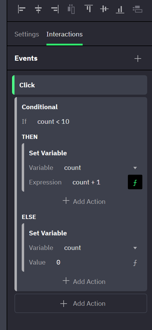
| Set Variable | Assigns a value, or the result of an expression, to a value variable |
| Conditional | Evaluates an expression and runs one of two nested action lists |
Everything an action changes lasts for the viewer's session and is never written to the document (→ Variables in preview). Which layers a Target field lists is covered in How interactions run.
Go To Artboard
Target lists the other artboards on the same page.
| Transition | What moves |
|---|---|
| Instant | Nothing; the artboards are swapped |
| Crossfade | The current artboard fades out while the new one fades in |
| Slide Over | The new artboard slides in above the current one |
| Slide Out | The current artboard slides away and uncovers the new one beneath |
| Push | Both move: the new artboard pushes the current one out |
- Direction is the direction of travel: with Left, the new artboard enters from the right edge.
- Easing None animates the same as Linear. This also applies to Resize.
- The new artboard is shown at the current viewport size, not at the size it has on the canvas.
- The next action does not wait for the transition to finish (→ How interactions run).
Open Modal
- Target — another artboard on the same page, or an instance placed directly on the page.
- Close on click outside — closes the modal on a click on the backdrop itself, not on a click inside the modal.
- The modal is centered over the current artboard on a dimmed backdrop. Several modals can be open at once: the most recently opened one sits on top, and
Esccloses it.
Close Modal
No parameters. It does nothing when no modal is open.
Open URL
URL is literal text, not an expression. The address always opens in a new browser tab.
Set Text
Target lists text layers only. Content is literal text, not an expression.
Change Visibility
Target and Type; no rules beyond what the panel shows.
Resize
- Type — Absolute sets the size, Relative adds to the current size (a negative number shrinks, and repeated runs add up).
- Width, Height — leave a field empty, showing (No change), to keep that dimension. Transition is Instant or Animated.
- When the action fills in Width, the editor changes the target's layout settings so that the width can be set:
- Horizontal sizing that is Fill or Hug content is switched to Fixed, whether the target is a Flex or Grid item, a Hug content container or a text layer.
- Horizontal anchoring that is Left + Right or Scale is switched to Left.
- Height does the same on the vertical axis: Fixed, and Top in place of Top + Bottom or Scale.
- The check runs when you edit the events of the layer that holds the action, not when the target's sizing or anchoring changes later.
Reset
- Target — the only parameter.
- Clears the session's changes on that layer — size, visibility, text, variant, input values, drag and resize results — but not on the layers inside it.
- On an instance it also returns the component behavior to its starting state (a checkbox returns to its Checked value) and clears the overrides that a variant switch carried onto the instance's children.
- A value that a variable binding drives stays as the variable has it: the layer shows the session's variable value again right after the reset. A bound built-in input such as Checked or Input value included: the control keeps the variable's value, not its starting value (→ Two-way binding on controls).
- It never touches variables, Sortable order (→ Draggable, Resizable and Sortable objects), or pan and scroll position (→ Scrolling in preview).
- To restore variables, add Set Variable actions that assign the starting values.
Set Component Variant
- Target — an instance of a component set. Change to — the variant to show. Resize to variant size — the instance takes the new variant's size.
- Picking a Target fills in the other two: Change to with the instance's current variant, and Resize to variant size on when the instance still follows its component's size, off when it was resized.
- When the component set has a behavior, Change to leaves out the state variants such as
:hoveror:checked; the behavior switches those. - The switch is instant, also when the component set has a transition for its behavior.
- Overrides and session changes on the instance's layers are carried over to the new variant (→ Overrides). Afterwards the instance runs the new variant's events (→ How interactions run).
Set Component Input
- Target — an instance. Input — one of its component's inputs. Value — a control that matches the input's type.
- Input lists the inputs that have a row on the instance: those bound to at least one property, plus the built-in inputs (→ Assigning inputs). Slots are never listed, and neither is an input the instance binds to a variable: the variable owns it, so use Set Variable (→ Two-way binding on controls). A radio button's Selected value is never listed, and its Checked is not while Selected value is bound (→ A radio group bound to a variable). An action whose input was bound after it was authored does nothing in preview; the Properties panel flags it, and an open debug console shows an error.
- Changing Target keeps Input and Value only when the new target is an instance of the same component — in a component set, of the same variant.
- The value applies on top of the one assigned on the instance until a Reset on that instance or a reload.
Emit Event
- Name — the event to send. The field suggests the names the component already emits.
- Offered on a component and on the layers inside it; elsewhere the menu shows it disabled, since nothing would receive it.
- The event reaches the instance of the component the action belongs to, and nothing beyond it. That instance's Component Event actions of the same name run at once, then the list continues (→ Component events).
Set Variable
- Variable — value variables only; expression variables are never listed (→ Value and expression variables).
- Value — a control that matches the variable's type. The
ƒbutton (tooltip Switch to expression / Switch to value) swaps it for Expression; switching back restores the earlier value. - When the value comes from a control the viewer uses, a toggle's state, a radio button's choice, a field's text or a picked color, binding the control's built-in input to the variable is usually the easier path: no event, no action, and every change reaches the variable at once (→ Two-way binding on controls). Set Variable remains the way for everything else: counters, choices made by clicking a button, values computed from an expression.
- The expression is evaluated every time the action runs, against the session's values at that moment, so
count + 1increments and!opentoggles (→ Expressions). - An expression that fails, or whose result does not match the variable's type, leaves the variable unchanged, and the rest of the action list still runs. An open debug console shows a warning (→ Errors).
- Deleting the variable or switching it to an expression empties Variable (→ Changing or deleting a variable).
Conditional
- If — an expression (→ What you can write). Then, Else — two action lists, each with its own Add Action.
- A truthy result runs Then;
false,0,""andnullrun Else. - An empty If, or one that fails, runs neither list; a failure shows as a warning in an open debug console.
- Both lists take any action, further Conditional actions included. Actions below the Conditional in the same event run in every case.
- The condition is evaluated when the action runs, not again when the variables change later.
Related
- How interactions run — targets, order, bubbling, variants and instances.
- Variables — what a session keeps and what a reload restores.
- Expressions — the language used by Set Variable and Conditional.
- Preview — opening and reloading a preview.