Binding properties to inputs and variables
Binding makes a property follow a component input or a variable: the field shows the source's value and changes whenever that value changes. You need it to parameterize a component, and to make a design react when an action changes a variable in preview. Also called: data binding.
Binding a property
Where: Properties panel → right-click a bindable field → Bind input or Bind variable. Hovering the field shows a bind icon at its right edge (tooltip Bind) that opens the same menu.
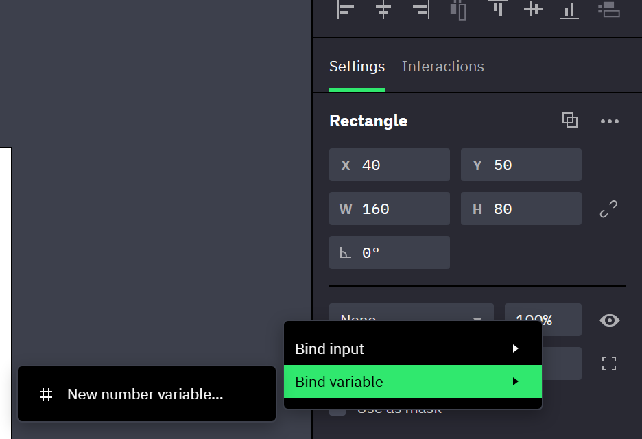
- One menu, two sources. Bind input lists the inputs of the component the layer belongs to, so it appears only on layers inside a main component and on the component's root. Bind variable lists the document's variables and appears on every layer that is not inside an instance; the one exception is text inside an instance.
- Each submenu lists only the entries whose type the property accepts, with a check mark on the current one. Picking another entry rebinds in place.
- With several layers selected, Bind input is offered only when every selected layer can take the input. Selecting the counterpart layer in each variant of a component set binds them all in one step. Bind variable binds the layers that can take it and skips the rest.
Some properties have their entry somewhere else:
- Fill and Stroke bind from their section header: right-click the header, or use the bind icon in it.
- Visibility has no icon. Right-click the eye button (Toggle visibility). This is the binding that tabs and show/hide prototypes need: bind it to a Boolean variable and let an action switch the variable.
- The padding values of a Flex container have no icon either: right-click the edge's value. The padding fields of a Grid container have the icon.
- A field you are typing in shows the browser's text menu on right-click. Use the bind icon, or click elsewhere first.
Creating the source from the menu
Both submenus end with creation entries, one per accepted type: New number variable… or New color input…, for example.
The New Variable dialog fills Name from the property and Value from what the field shows, so Create binds the property without changing the design, in one undo step. A color value accepts any color format. A new input starts from the field's current value in the same way.
Unbinding
The same menu shows Unbind input or Unbind variable, followed by the name of the source. When the selected layers follow different sources it reads Unbind inputs or Unbind variables and releases all of them.
The property keeps the value it last showed.
Going to the source
Next to Unbind, the menu offers Go to variable or Go to input, followed by the name of the source:
- Go to variable opens the variables panel at the variable and highlights its row. When the selected layers follow different variables, it opens a submenu naming each.
- Go to input selects the component that declares the input and highlights the input in its list.
Both are also offered in a document you can only view.
What a bound field looks like
A bound field is outlined in purple, its bind icon stays visible in the same color (tooltip Edit binding), and the field's tooltip names the source: Bound to input Label, Bound to variable accent. For Fill and Stroke the tooltip sits on the icon in the section header.
- A property follows one source at a time: bound to an input it offers no Bind variable, bound to a variable no Bind input. Unbind first.
- The field locks. You can't type over a bound value, and on an instance the context menu offers no Reset for it.
- Controls that belong to a bound field lock with it, without an outline: the individual corner fields and the Individual corners toggle, the per-side stroke widths, and the padding lock toggle.
- A text layer whose Content is bound can't be edited on the canvas.
- Text size and Fill on a text layer don't lock when they follow a variable: an edit over those characters removes the binding (text ranges).
- On an instance, a property that the component's root binds to an input shows as bound but has no unbind entry: the binding lives on the component.
Binding an instance's input to a variable
Where: select an instance → Properties panel → right-click an input row → Bind variable. The row's control also shows the bind icon on hover.
- This is how a variable reaches one particular instance: it sets the input, and the component's input bindings pass the value on (instances).
- A String input accepts a String or a Number variable (the number becomes text). Number, Boolean and Color inputs accept a variable of their own type. New … variable… creates one of the input's type, starting from the value the instance shows.
- A bound row locks and gets the same outline and tooltip. With several instances selected, a shared row locks as soon as one of them is bound, and the menu acts on all of them.
- The rows of an instance nested inside another instance offer no Bind variable (instances).
Two-way binding on controls
A value variable bound to the built-in input that holds what a control shows — Checked on a Checkbox or Toggle, Selected value on a Radio button, Input value on an Input, Text on a Textarea, Color on a Color input, Value on a Slider — is two-way in preview: the variable sets the control, and what the viewer does with the control writes the variable. Nothing marks it; the binding is an ordinary Bind variable on the row.
- Every change counts: each keystroke in a field and each click on a toggle writes the variable at once, a drag inside the color picker writes it as the color changes and a dragged slider thumb as it steps, and everything bound to that variable follows (→ Variables in preview).
- An expression variable stays one-way: the control shows its result, and the viewer's edits do not reach it. Switching the variable between value and expression switches the row along with it.
- A Number variable on a text field takes the typed text when it is a number; other text leaves the variable as it was.
- A slider shows a variable's value outside its range, or between its steps, as the nearest step within the range, and leaves the variable as it is until the viewer drags the thumb (→ Value, Start, End and Step size).
- A Set Component Input action never targets a bound input: the variable owns the value, so set the variable instead (→ Set Component Input). A Reset on the instance leaves a bound input on the variable's value.
- On a Checkbox or Toggle the binding takes the place of a Check or Toggle event with Set Variable. A Set Variable on the same variable in the instance's Click, Check or Toggle event runs after the click has written the variable, so an expression such as
!isOntakes the click back; the Validation console flags such an action (→ Validation console). - On a Radio button the variable is the choice of the whole group: bind every instance's Selected value to it, and a click writes the clicked instance's Option value (→ A radio group bound to a variable).
Related
- Binding rules and edge cases — what a binding changes besides the value, and what ends it.
- Component inputs — defining inputs and typing their values on an instance.
- Expressions — deriving one value from another in an expression variable.
Bindable properties
A dash means the source can't be bound to that property. For every row: layers inside an instance have no bind menu, except for text size and Fill on their text (instances); an instance override wins over a bound value (overrides); variable bindings don't travel to another document (paste).
| Property | Input | Variable | Notes |
|---|---|---|---|
| Content (text layers) | String, Number, Color | String, Number, Color | A number shows as plain text, a color as its hex value (#336699, #336699 50%). Format numbers in a String expression. |
| Visibility (Toggle visibility) | Boolean | Boolean | Context menu only. |
| Opacity | Number | Number | 0–100, the percentage the field shows. |
| Width, Height | — | Number | Binding sets the axis to Fixed; Hug or Fill sizing removes the binding. See size. |
| Fill, Stroke | Color | Color | The paint list becomes one solid paint. See paints; input-bound paints also take adjustments. |
| Fill on a text layer | Color, whole text | Color, selected characters or whole text | See text ranges. |
| Fill on a vector layer | Color, all shape areas | — | See paints. |
| Text size (Typography) | — | Number | Selected characters or whole text. See text ranges. |
| Stroke width | Number | Number | All sides together, through the Stroke width field. |
| Corner radius | Number | Number | All four corners together, through the single Corner radius field. Not on vector layers. |
| Flex gaps (Spacing between children, Spacing between rows) | Number | Number | Negative values are allowed. Grid gaps have no bind menu. |
| Padding, Flex and Grid | Number | Number | Each edge on its own; binding an edge unlocks the padding. |
| Input row of an instance | — | By input type | See Binding an instance's input to a variable. |
A property that is not in this table has no bind menu. To derive one value from another, bind an expression variable (expression functions).