Transitions between states
A transition animates the switch from one state variant to another when a component behavior changes an instance's state in preview: layers that exist in both variants tween from their values in the old state to their values in the new one. You need it when hover, pressed, focus or checked feedback has to ease in instead of switching at once. Also called: state animations, animated states.
For the states, their names and the behaviors that switch them see Variants and interactive states.
Transition rows
Where: select a component set with a behavior, or one of its variants → Properties panel → the transition rows below the behavior dropdown (tooltip Behavior).
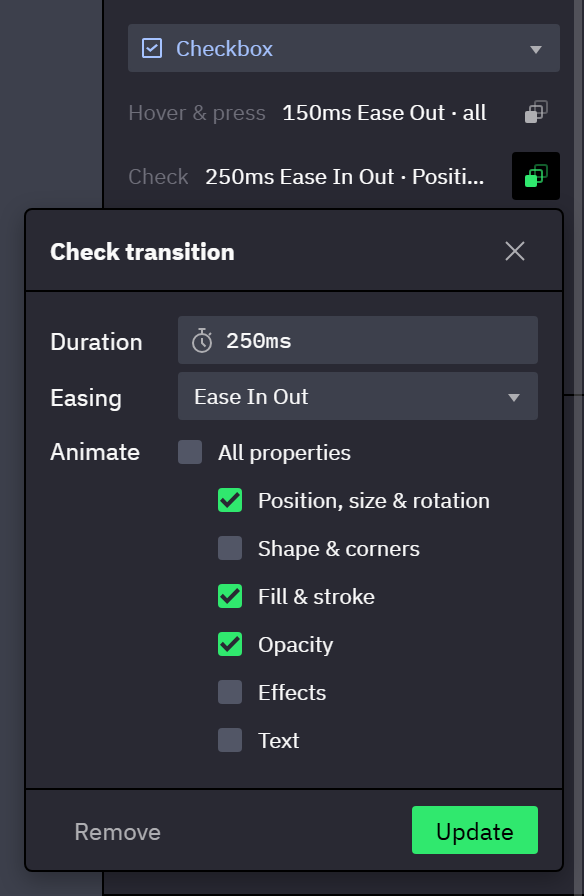
- Each row sums up its transition:
No transition, or its duration, easing and categories, for example200ms Linear · all. Without a transition the switch is instant. - The button at the end of a row opens the transition dialog for that row. Its tooltip names the states of the row, for example Edit the transition between the checked and unchecked states.
- A transition belongs to the component set and applies to every instance of it.
| Row | Behavior | Plays on |
|---|---|---|
| Hover & press | Button, Checkbox, Radio button, Toggle | Switches between the base state, :hover and :active |
| Hover | Input | Switches in and out of :hover |
| Focus | Input | Switches in and out of :focus |
| Placeholder | Input | The switch between :placeholder and the filled field as it fills or empties |
| Check | Checkbox | Switches between :unchecked and :checked |
| Select | Radio button | Switches between :unchecked and :checked |
| Switch | Toggle | Switches between :off and :on |
- A click that checks an instance plays the Check, Select or Switch transition, also when its pointer state changes at the same moment.
- On an Input, a switch that changes focus plays the Focus transition, whatever else changes with it. The Placeholder transition plays only when the placeholder state is the one thing that changes.
- An instance appears in its starting state without a transition.
- A switch that starts while another one is still running continues from what is on screen: a pointer that leaves a button halfway through its hover transition turns it back from the halfway point.
The transition dialog
Where: a transition row → the button at the end of the row.
| Field | Sets |
|---|---|
| Duration | The length of the transition in milliseconds. |
| Easing | How the tween speeds up and slows down, from Linear to Ease In Out Cubic. |
| Animate | All properties, or the categories of properties that tween (→ What each category animates). |
- A row without a transition opens the dialog at 200 ms, Linear, with All properties checked. Set confirms.
- A row with a transition opens the dialog with its values. Update confirms, Remove makes the switch instant again.
- Unchecking All properties lists the categories below it, none checked, to pick from. Checking it again hides the list and forgets the picks.
- With All properties unchecked and no category checked, Set and Update are disabled. To make a switch instant, use Remove.
Enterconfirms the dialog.Esc, the close button and a click outside the dialog close it without a change.
What each category animates
A property outside the checked categories switches at the start of the transition, while the checked ones tween.
| Category | Tweens |
|---|---|
| Position, size & rotation | Position, width, height and rotation; padding and gaps of a managed layout; where a Flex or Grid layout places a layer |
| Shape & corners | Vector shapes; corner radii |
| Fill & stroke | Fills and strokes of frames, shapes and text layers, text color and highlights included; stroke widths |
| Opacity | Opacity; the fade-in of layers that only the new state has |
| Effects | Shadows, blurs and color adjustments |
| Text | Letter, word and line spacing; paragraph spacing and indent; the axes of a variable font, such as weight or width |
- Without Position, size & rotation, the new state's layout applies at once, and only the other categories tween.
- Without Opacity, layers that only the new state has appear at once.
- Every property the table does not list switches at the start: visibility, blend mode, font, font size and clipping among them.
How layers are paired between variants
A transition tweens each layer of the new state from its partner in the old state. The two variants are separate drawings, so preview pairs their layers by these rules, in order:
- Built-in inputs. A layer bound to a built-in input (Checked, or an Input's Input value or Placeholder text) pairs with the layer of the same type bound to the same input, whatever the two layers are named. It pairs by its input only, never by its name.
- Name and type. Any other layer pairs with the layer of the same name and the same type in the other variant — a rectangle named
Knobwith the rectangle namedKnob— wherever each one sits in its variant. Several layers with the same name and type pair in layer order: the first with the first, the second with the second. - Nested instances. An instance pairs by name only with an instance whose component, or component set, has the same name.
- The same rules decide which layer an override moves to (→ Overrides across a variant switch): a transition follows a layer exactly where an override would.
- A layer of the new state without a partner fades in.
- A layer of the old state without a partner disappears at the start of the transition. To fade a layer out, keep it in the new state with opacity 0.
- Hiding or showing a layer switches at the start. Set its opacity to 0 instead of hiding it when the layer should fade.
- Keep layer names identical across the variants of a set. A layer renamed in one variant loses its partner: the old one is gone at the start and the new one fades in, where a layer with the same name would move.
Limits of the tween
- A fill or stroke that only one state has fades in or out. Two fills that can't blend into each other, such as a solid color and a gradient, switch at the start.
- Effects tween pair by pair in the order of the list, when both states have the same number of effects. An effect that only one state has switches at the start, and so does a pair of two different effects. To fade a shadow in, give the other state the same shadow with a transparent color.
- A text layer's color and spacing tween when both states show the same words. A color or spacing set in only one state tweens from or to the default. A text layer whose words differ between the states switches at the start.
- The axes of a variable font tween when both states use the same font. An axis set in only one state tweens from or to the font's default.
- A color or a spacing that covers different stretches of the text in the two states switches at the start. The rest of the text layer tweens.
- A spacing that changes its unit switches at the start, and so does a line height that is set to auto in one of the states.
- A vector shape tweens when both states have the same points and segments. A vector whose fill is overridden on the instance, or whose stroke is aligned inside or outside, changes its shape at the start, while its colors tween.
- Position follows each variant's constraints at the instance's actual size: a layer anchored to the left edge in one state and to the right edge in the other slides between the two edges however far the instance has been resized.
- A layer placed by a Flex or Grid layout slides from where the old layout drew it to where the new layout draws it, so a knob that switches from start to end alignment travels across its container.
With events, overrides and actions
- The instance shows the new state variant from the start of a transition, so the events of the new variant apply at once (→ Events on state variants).
- A transition ends on what the instance shows in the new state, with its overrides and the changes made during the session (→ Overrides across a variant switch).
- A Set Component Variant action switches instantly, also when the set has a transition.
- A Reset action returns the instance to its starting state instantly.
- A width or height that an animated Resize action is changing stays with the action, whichever of the two started first: the transition does not tween that size.
Related
- Variants and interactive states — state names, and the states each behavior switches between.
- Text fields and forms — the states behind the rows of an Input.
- Overrides — what an instance keeps when its state changes.